
Enter opaque text and background colours. The ratio helps compare a solid pair against WCAG text thresholds; it does not certify an entire overlay or moving video.
A contrast ratio with an honest interpretation of the solid-colour pair.
Try it with your setup.
Change the example, update the preview, then keep the notes you want to use. Everything stays in this browser unless you download or print it.
Worked example
Contrast 21:1. Meets 4.5:1 normal-text and 3:1 large-text thresholds for this solid colour pair. At 50% opacity, white over black becomes #808080: approximately 5.32:1.
In this guide
Before you start
- Two opaque colours written as six-digit hexadecimal values.
- Sample text you expect viewers to read.
- A plan to inspect the final text size and background in a recording.
Measure the colours that actually meet
Choose the text colour and the solid colour directly behind it. If the text sits over a translucent panel, a gradient or gameplay, this tool does not calculate that complete composition. Use a deliberate opaque background if you need the result to describe a predictable pair.
The sample text helps you look at the combination, but its wording does not affect the number. Check the actual display size separately. A mathematically strong pair can still be hard to read when the letters are tiny, thin or surrounded by distracting motion.
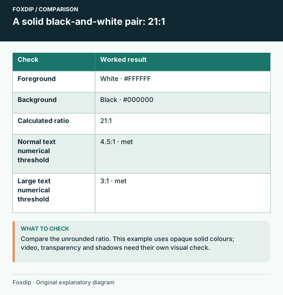
Foxdip worksheet example. Change the inputs above to make your own plan.
Know what the number represents
The calculation linearizes the sRGB channels, combines them into relative luminance and compares the lighter and darker colour. Identical colours give 1:1; black and white give 21:1. The formula measures light-dark contrast, not whether two hues look attractive together.
For the text criteria shown here, WCAG uses 4.5:1 for normal text and 3:1 for qualifying large text. Large text has a defined meaning in the standard; a heading that merely feels large is not automatically in that category. The checker reports both thresholds so you can interpret the pair without pretending to evaluate your whole scene.
A rounded display must not turn a failure into a pass
White text on black gives 21:1. As a more revealing comparison, #777777 on white gives approximately 4.478089:1, which is below 4.5. #767676 on white gives approximately 4.542225:1, which is above it. These values are direct calculations using the documented formula.
Both pairs may look similar at a glance. That is why the threshold comparison uses the unrounded result, even if the display shows fewer decimals. W3C explicitly says a value such as 4.499 must not be rounded up to satisfy 4.5.
Compare one revision at a time
Enter the colours and choose Update preview. If the pair misses your target, change the foreground or background while preserving the text's role in the scene. You might need a darker text panel rather than a radically different brand accent.
Check the real delivery
Use the revised pair in a short scene recording and view it at phone size.
Look for: The intended text remains readable in its normal position and size.
If it does not, enlarge or simplify the text, strengthen its backdrop, or reduce nearby motion; a passing ratio alone does not resolve those issues.
Keep the colour roles with the result
Download notes or Print the colour values and ratio for your graphics brief. Save in this browser can retain a local comparison, and Reset clears the fields for another pair. Name the role, such as body text on a dark panel, so the result is not reused on an unrelated background.
Repeat the check when you change opacity, font weight or where the text sits. This is a focused solid-colour calculation and visual review aid. It does not examine captions, focus states, every overlay element or every other requirement needed for an accessible experience.
Check the colour after text opacity is applied
Choose text opacity to model the resulting colour over the selected solid background. At 50% opacity, white over black becomes approximately #808080 in this 8-bit sRGB model, with a contrast ratio near 5.32:1.
The 4.5:1 and 3:1 comparisons apply to normal and large text respectively. Large text means at least 18 pt, or 14 pt bold, at the size actually viewed; scaling a stream down can change that context.
This sample does not evaluate gameplay, moving backgrounds, outlines or antialiasing. Check the actual scene at viewer size and at the brightest and darkest background states.
Sources & references
An original Foxdip worksheet or calculation, with linked platform references reviewed on 27 October 2026.
- W3C — WCAG 2.2 relative luminance and contrast definitions ↗Checked 2026-10-27
- W3C — Understanding WCAG 2.2 Contrast Minimum ↗Checked 2026-10-27
- W3C: Understanding contrast minimum ↗Checked 2026-11-04
Spotted something out of date? Let Alex know.
How we put our guides together ↗