
Choose one important label and compare its text colour with the colour directly behind it. If the pair is weak, change one colour or add a solid background, then review it in a small video player.
You have a stronger colour pair for your label and know how it looks in the saved video.
In this guide
Before you start
- One label or status message, with its original colour values.
- An editor that shows those colour values.
- A contrast calculator that uses the W3C relative-luminance formula.
Start with a message that matters
Choose Be Right Back, Mic muted or the name of a segment. You want something people need to read, not every decorative colour in the scene. Write down the text colour and the colour immediately behind the letters. A mostly navy scene can still have a pale patch right where your cream heading sits.
If you can edit the design, take those values from the original fills. A screenshot can help you spot a problem, but compression, smoothing and scaling can change its sampled colours. For this first check, use opaque text on a solid opaque block. You will come back to moving scenes after you have a pair you can control.
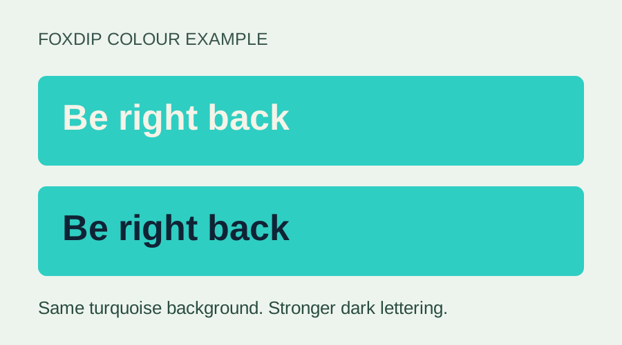
An original colour example, not a software screenshot. The turquoise stays the same; changing cream lettering to navy makes the words easier to distinguish.
Check the two colours together
W3C’s text guidance uses 4.5:1 for ordinary text, with exceptions that include qualifying large text. For a streaming label, aiming for at least 4.5:1 is a sensible starting point. The large heading in your editor may become a small label when someone watches in a smaller player. The ratio covers that colour pair; other accessibility checks still matter.
Put the foreground and background hex values into a contrast calculator. Keep the values with the result so you can recreate the pair later. At the threshold, use the exact result: a rounded display of 4.5 does not pass if the value underneath is below 4.5. Repeat for each pair you plan to use.
A useful contrast result still needs a full-scene readability review. Stream Layout Readability Check: Make the Important Parts Easy to See ↗
Keep the bright accent; change the lettering
These five examples use explicit opaque sRGB colours and the W3C relative-luminance formula. The displayed results are rounded to make the table easier to scan. They show what happens to particular colour pairs, rather than grading a finished Foxdip page or a broadcast.
Look at the turquoise and orange rows. Cream text on those bright colours gives a weak pair, while navy lettering keeps the accent and makes the words stand out much more. You may not need to mute your whole palette. Changing the lettering can be the smaller fix, and these examples are far enough from 4.5:1 to make that choice clear.
| Text | Background | Calculated contrast | Palette decision |
|---|---|---|---|
| Cream #F6F3E8 | Navy #102335 | 14.39:1 | Useful starting pair for a text panel |
| Turquoise #2FCEC2 | Cream #F6F3E8 | 1.76:1 | Change the text or background |
| Navy #102335 | Turquoise #2FCEC2 | 8.17:1 | Try dark text on the bright block |
| Orange #F49A50 | Cream #F6F3E8 | 1.97:1 | Keep this accent away from essential cream-background text |
| Navy #102335 | Orange #F49A50 | 7.30:1 | Try dark text on the orange block |
1.76:1 · change the pair
8.17:1 · stronger separation
Calculated opaque colour pairs from the table above. This example is live text, not a screenshot or a stream certification.
Carry the same look into your About section, with words and links that visitors can use. Set up your Twitch panels ↗
Give the words somewhere steady to sit
Once gameplay or animated scenery sits behind the label, the background changes. Check a bright moment and a dark one, not just the calm frame you happened to use while designing. Look at the area touching each letter. The average colour of the whole scene will not tell you whether a pale word disappears over a flash.
A solid label block is often the easiest repair because you can choose its colour. A translucent one blends with the scene underneath, so check the resulting combination too. An outline or halo may help separate the text, but do not stop at the editor’s attractive glow: the words still need to hold up when the background moves.
Watch the saved result at a smaller size
Make a short local recording with the revised label, then open it in a smaller player. Read the actual words without zooming. If you struggle, shorten the message, choose stronger letter shapes or give the label more space. A strong contrast ratio cannot make a very thin, tiny typeface easy to read on its own.
Keep a written label when colour indicates a state. “Mic muted” tells the viewer more than a dot changing from green to red. When you are done, keep the two colour values and the recording you checked. You will have a repeatable starting point for the next label, plus a clearer idea of what still needs work.
Test the background at its worst moment
For text over moving gameplay, a single colour-pair measurement is only a starting point. Capture a bright moment and a dark moment beneath the actual label. If the same letters disappear in either, compare an opaque backing, a stronger edge or a different position using the finished recording.
W3C explains that thin or unusual fonts can look weaker than a nominal contrast value suggests. Treat its ratios as a design reference and inspect the downscaled result as well. A passing calculation for two sampled colours is not an accessibility certification of the complete video.
| Observation | Next change | Expected result |
|---|---|---|
| White text disappears over sky or snow | Add a consistent backing or move it away from that area | The label no longer depends on game brightness |
| Dark outlines merge into busy detail | Simplify the backing and compare at viewer size | Letter shapes remain distinct |
| Contrast looks strong but narrow strokes vanish | Choose a heavier or larger rendering | Readability survives compression and downscaling |
Evaluate text after the complete scene is scaled to a smaller player. Stream Layout Readability: Can Viewers See What Matters? ↗
Want graphics that already fit? Browse animated overlays ↗
Sources & references
The example ratios use the W3C contrast formula for opaque sRGB colours; they are palette calculations, not a full accessibility audit. November 2026 addition: documentation-based diagnostic examples; no new hands-on hardware result or platform upload test is claimed.
- W3C WAI — Contrast (Minimum) ↗Checked 2026-11-04
- W3C WAI — Technique G18 ↗Checked 2026-10-18
- W3C WAI — Use of Color ↗Checked 2026-10-18
Spotted something out of date? Let Alex know.
How we put our guides together ↗