
Start with a frame, four useful screens and a small set of headings. Quiet Signal repeats a dark blue background, warm white type and small mint/amber accents across those jobs. Your camera, content and information remain the focus; the graphics give them a consistent edge.
In this guide
Give the pieces different jobs
A waiting screen needs a message you can read at a glance. A camera frame needs an opening for the camera. A panel heading needs to tell a visitor what information lives below it. Quiet Signal gives those jobs a shared palette without trying to turn them into the same layout.
The kit stays deliberately small: four screen designs, one frame design and six panel headings. The twenty-eight media files include source SVGs and different PNG sizes, so that total should not be confused with twenty-eight different designs.
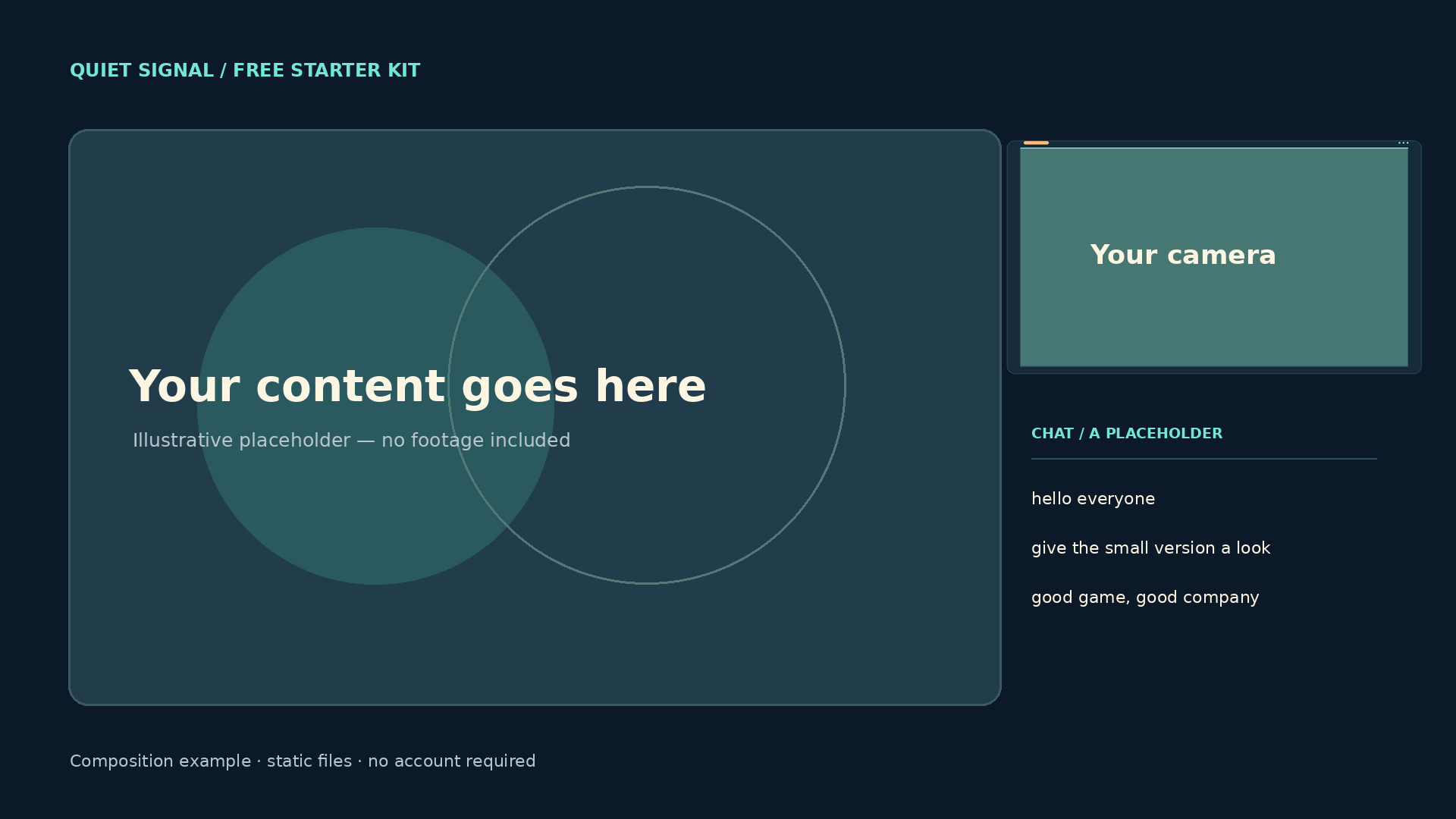
Original composition example using the included frame. The labelled camera, content and chat are placeholders that you replace with your own sources.
You can follow this example with the free kit. Get the files and setup ↗
Repeat the small choices
Dark blue gives the screens and panels a common base. Warm white keeps the main wording easy to spot. Mint marks the edge or a small detail, while amber provides a second accent. The colours appear in small amounts so the text and content can keep their own space.
The thin lines and circular outlines are part of the design, not controls or a live interface. They carry the visual language between a full-screen message and a small heading without adding a fake dashboard.
| Element | Choice in Quiet Signal | Job |
|---|---|---|
| Background | Dark blue | A consistent base across screens and headings. |
| Main wording | Warm white | One message to read first. |
| Accents | Mint and amber | Small points of emphasis. |
| Shapes | Lines, circles and rounded edges | A repeated visual vocabulary. |
Leave the content room to breathe
The scene illustration puts the larger content area on the left and the camera/chat area on the right. That is one layout example, not a universal rule. A game with important information on the right might need the arrangement reversed or a smaller camera.
The kit does not include the sample content, a person, camera feed or chat widget. Those labelled placeholders show the space you need to reserve. Replace them with your own sources and watch a short recording before deciding that a corner is safe.
Work with the game or content you will actually show. Plan your protected areas ↗
Remember the frame has two boxes
The outside of the camera PNG is 1280×720, while the clear opening is 1152×648 at x=64, y=36. Both boxes are 16:9, but they are not the same size. That difference is why placing the camera and frame at identical outer bounds does not line up their edges.
Resize the frame proportionally, fit the camera to the inner opening and keep the frame above it in the source order. If you halve the frame, halve the opening and offsets too: 576×324 at x=32, y=18 relative to the frame.
If a frame disappears, check what is above it before changing the file. Try the source-order exercise ↗
Give each heading a purpose
About, Schedule and Rules make a manageable first set. Socials, Support and Discord can follow when those destinations are ready. A matching heading gives a section a visual anchor, but the useful part is still the description and working link you put beneath it.
The free SVG sources let you change a heading for your own channel. Check the exported PNG after editing: a longer word or replacement font can change spacing. The included PNGs preserve the supplied appearance if you would rather leave the design alone.
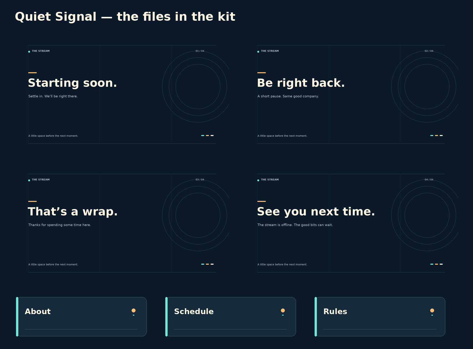
The four screen designs and three of the six panel headings in the kit. PNGs are ready to use; the corresponding SVG sources are editable.
Decide what each section needs to say before adding more headings. Draft your panel descriptions ↗
Start with the static files
The kit has no animation, sound, alert events or automatic integration. That keeps the first installation focused: an Image source for a screen, another Image source for the frame and your own sources underneath.
After the basic scene works, add motion or event media only where it has a job. A new alert pack can add a moment of celebration; it does not need to replace a layout that already fits your content.
If alerts are your next addition, check the events, timing and provider setup. Compare alert media ↗
Keep what works, then change the style
Quiet Signal is free for your own creator channels, including monetized streams and videos, under its included licence. You can keep using it and edit its SVGs for that use. It remains non-exclusive and its downloadable files cannot be resold or redistributed as another pack.
If you later choose a paid visual identity, carry the lessons across: keep the important content visible, match the correct files and give each new element a reason to be there. Buying more artwork is optional; a finished, readable scene is the useful result.
See how the included components and editing options differ. Compare current overlay packs ↗
Sources & references
This case study describes the original Quiet Signal files supplied with the free kit. File dimensions and contents were checked against those exports. The composition is a labelled illustration, not a live stream or an OBS screenshot.
- Foxdip — Quiet Signal file list ↗Checked 2026-10-27
- Foxdip — Quiet Signal creator licence ↗Checked 2026-10-27
- OBS — Image Sources ↗Checked 2026-10-27
Spotted something out of date? Let Alex know.
How we put our guides together ↗