Put the brightest neon outside the game’s important information and give the scene one dominant accent. Let the game remain the moving centre; the cyberpunk frame can supply the atmosphere at the edges.
In this guide
Separate structure from glow
Use a dark frame to define the camera or information strip, then add a narrow luminous line where you want emphasis. A glow is a visual effect around that structure, so include its full spread when judging how much of the game it covers. A thin border can still occupy a wide area when its halo is strong.
Try a charcoal-blue base with cyan as the main signal and a small magenta detail only for events. If cyan, magenta, yellow and green all shine equally, the frame has no obvious hierarchy. You can keep the cyberpunk mood through angular cuts, grid spacing and material texture while reducing the number of glowing colours.
| Element | Intensity choice | Reason |
|---|---|---|
| Game area | Unfiltered original content | Keep the play readable |
| Camera edge | One narrow cyan line | Identify the face area |
| Routine labels | Quiet pale text | Avoid competing with action |
| Event accent | Brief magenta detail | Reserve contrast for a change |
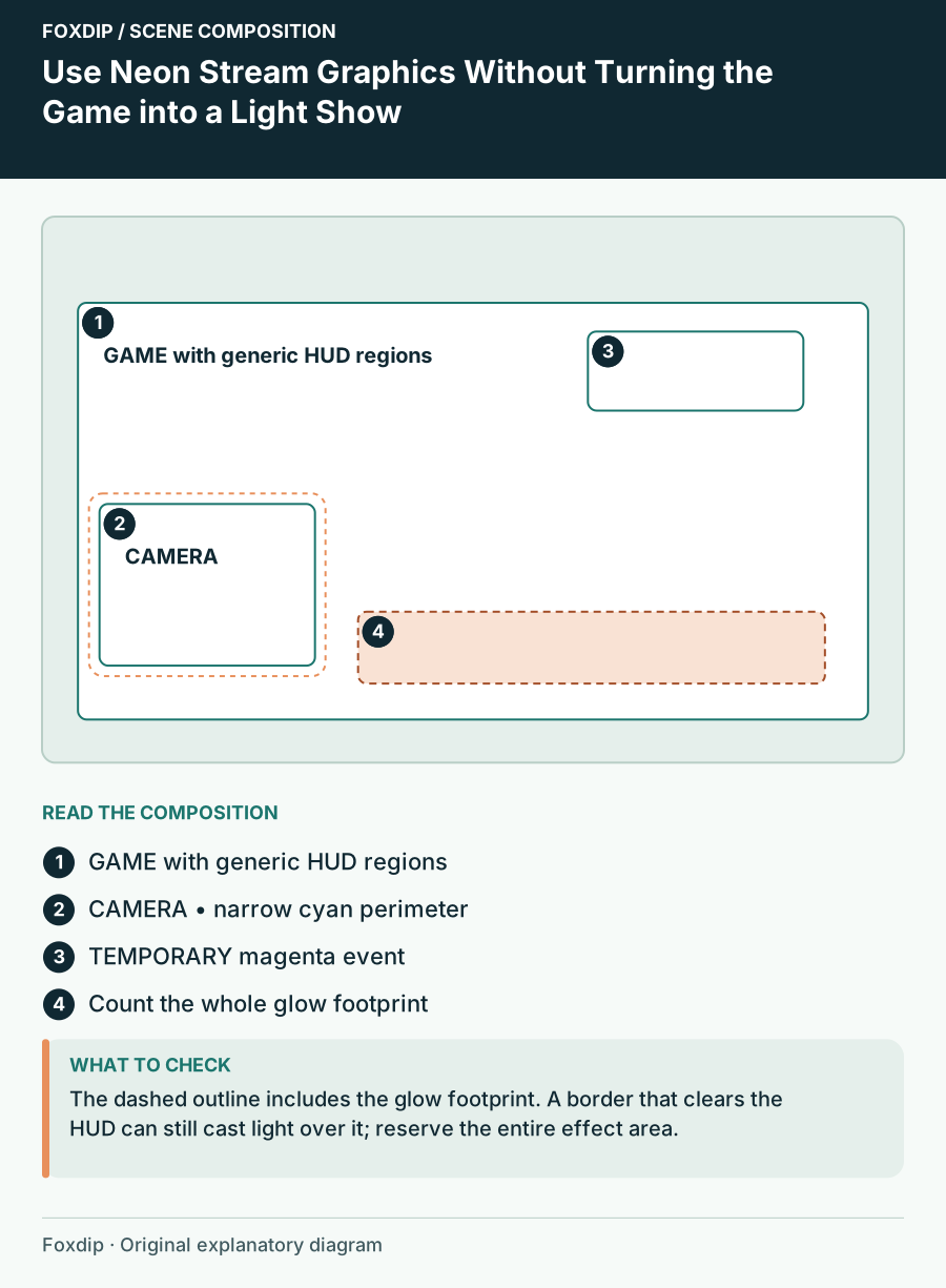
Original Foxdip scene plan. Positions illustrate this example; check the actual game or camera view.
Place the visual energy at the perimeter
Imagine a gameplay layout with a camera in a clear lower-side region and a shallow information strip beside it. Run the strongest line along the outer edge of those blocks, away from the centre of the game. Do not draw a bright crosshair-like ornament near the real aiming area.
Check the actual game’s HUD rather than assigning a universal corner. A minimap, ammunition counter or objective list can occupy the location a product preview leaves empty. OBS’s game-layout guidance makes preserving important game information part of camera placement. Apply that principle to luminous decoration too, including animated particles that extend beyond their frame.
Choose one motion role for each scene
Gameplay can use a mostly still frame with an event animation in a reserved region. A Starting Soon scene has room for slower environmental movement and a larger light feature. The conversation scene can use a subtle accent near the topic card. The same visual language does not require the same amount of movement everywhere.
Avoid a permanent equal-intensity pulse across every edge. When an alert appears, its movement should be distinguishable from the background. If you cannot tell which motion signals a new event, reduce the routine animation before increasing the alert’s size. The goal is an understandable hierarchy, not maximum brightness.
Give text a solid landing area
Place names and status labels on a stable dark panel. A neon outline around thin lettering may look dramatic in a large preview but become harder to separate when reduced. Keep the word itself plain enough to recognise; let a line or small corner cut provide the style.
Use a short label such as Next match or Current route instead of squeezing a long sentence into a narrow futuristic plate. Check the longest viewer name you expect to display, and allow it to wrap or fit in a defined region. A decorative frame should not force every live label into an unreadably small size.
Test a busy frame from the real stream
View the layout during a bright outdoor scene, a dark corridor and a menu with small text. Check whether the glow spills over labels or makes a corner feel permanently active. Compare a still-frame version with the animated version in a local recording; choose the one that leaves the game easier to follow.
When selecting cyberpunk assets, look at glow extent, animation placement and editable labels rather than the theme name alone. Confirm the current product contents before expecting a transparent overlay or separate frame. A strong neon identity can come from one recognisable light treatment repeated carefully across scenes.
Sources & references
Foxdip editorial design advice with platform behavior grounded in the linked official documentation. Layout dimensions and palettes are worked examples, not platform requirements.
- OBS: Stream Layout Tutorial 1: Game Screen ↗Checked 2026-10-27
Spotted something out of date? Let Alex know.
How we put our guides together ↗