Build the mood with dark framing and a few carefully placed highlights, then give important text its own quiet surface. Gothic detail works best around the content rather than woven through every word.
In this guide
Choose the source of light
A candlelit archive, a moonlit chapel and a purple crystal chamber imply different colours and contrast. Pick one. In a candlelit archive, warm highlights on dark wood can support a calm conversation; a crystal chamber may use cooler edges and a more otherworldly accent. Mixing every source can make the palette difficult to control.
For the worked example, choose a midnight archive. The background is blue-black, the structural trim is muted plum and the light comes from a small warm lamp. Use the lamp’s colour for a few highlights, not for every outline. The central camera and message areas remain more visually stable than the surrounding shelves.
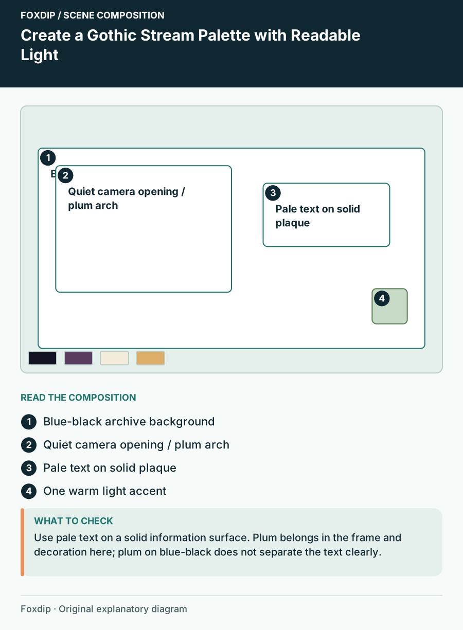
Original Foxdip scene plan. Positions illustrate this example; check the actual game or camera view.
Separate mood colour from text colour
Dark purple on black can suggest atmosphere while being a poor choice for a necessary status line. Use a pale neutral for the main wording and reserve the purple for structure or illustration. Put a solid dark panel behind text that otherwise crosses books, stone or smoke.
Try the proposed palette below as a starting point, then check the actual text-background pair. The values are creative suggestions, not verified accessibility ratings. A palette can be harmonious and still fail for small labels when two colours have similar brightness.
| Role | Proposed colour | Use |
|---|---|---|
| Deep background | #111323 | Outer room |
| Structural plum | #5A3C60 | Trim and broad shapes |
| Pale text | #F3EBDC | Primary labels |
| Warm light | #DDAE67 | Small focal highlights |
Keep ornate detail out of functional openings
Place arches, vines or carved corners around the camera boundary. Leave the opening itself clear, including the area where your face moves. For a topic card, use one decorative edge rather than a complete illuminated manuscript border. The viewer should find the wording before exploring the ornament.
If you want a highly ornate waiting scene, let it have that role. Use a quieter gameplay variant with the same arch silhouette or material treatment. You can preserve the mystical identity with fewer visible details when the game already has a complex interface. Matching scenes need not share identical density.
Make the supernatural accent purposeful
Choose one motif: a crescent, a key, a crystal or a small constellation. Repeat it near the scene title and perhaps in a panel divider. Several competing symbols can imply an elaborate story, but they also create more focal points than a small stream player can comfortably support.
If the motif moves, keep the movement away from faces and essential text. A slow glow near a corner is a different choice from smoke passing repeatedly across the message. Compare a complete animation cycle with real content present. Do not assume a dark effect is subtle just because its colours are muted.
Review dark and bright content together
Place a bright game or pale document into the scene, then switch to a dark one. The surrounding frame should still feel like a boundary, not disappear in one state and dominate the other. OBS’s source and transform tools let you arrange the content precisely; the mood decisions remain your own design choices.
When choosing art, inspect the intended text spaces, transparent regions and fixed labels. Avoid assuming every gothic pack includes editable wording or separate ornaments. The final composition should keep the atmosphere at the edges while letting a new viewer identify the camera, current topic and stream state without searching through the shadows.
Sources & references
Foxdip editorial design advice with platform behavior grounded in the linked official documentation. Layout dimensions and palettes are worked examples, not platform requirements.
- OBS: Sources Guide ↗Checked 2026-10-27
Spotted something out of date? Let Alex know.
How we put our guides together ↗