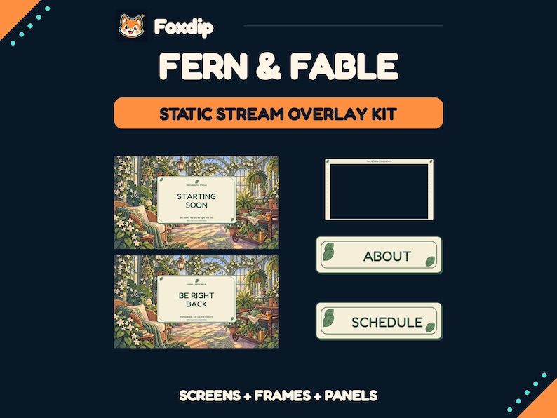
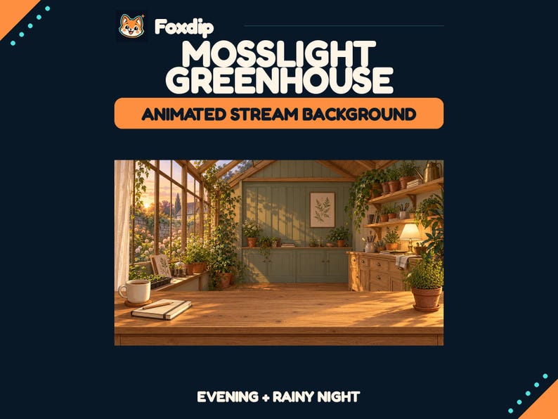
Use the potting room as a setting around the stream, then keep the actual work area quiet. Let one shelf, one plant silhouette and a small set of earthy colours carry the theme instead of surrounding every source with flowers.
In this guide
Choose a specific place inside the theme
A cottagecore scene becomes easier to compose when it describes a place. Try an early-morning potting room: pale plaster, a dark wooden bench, one climbing stem and a small window. This gives you materials and a direction for the light without requiring a full collection of unrelated woodland objects.
The worked layout here is for a gardening game or a making stream. The central area belongs to the game or overhead view; the illustrated room provides context around it. If you already use a cozy mascot, let it appear in one small accent rather than adding a second main character that competes with your work.
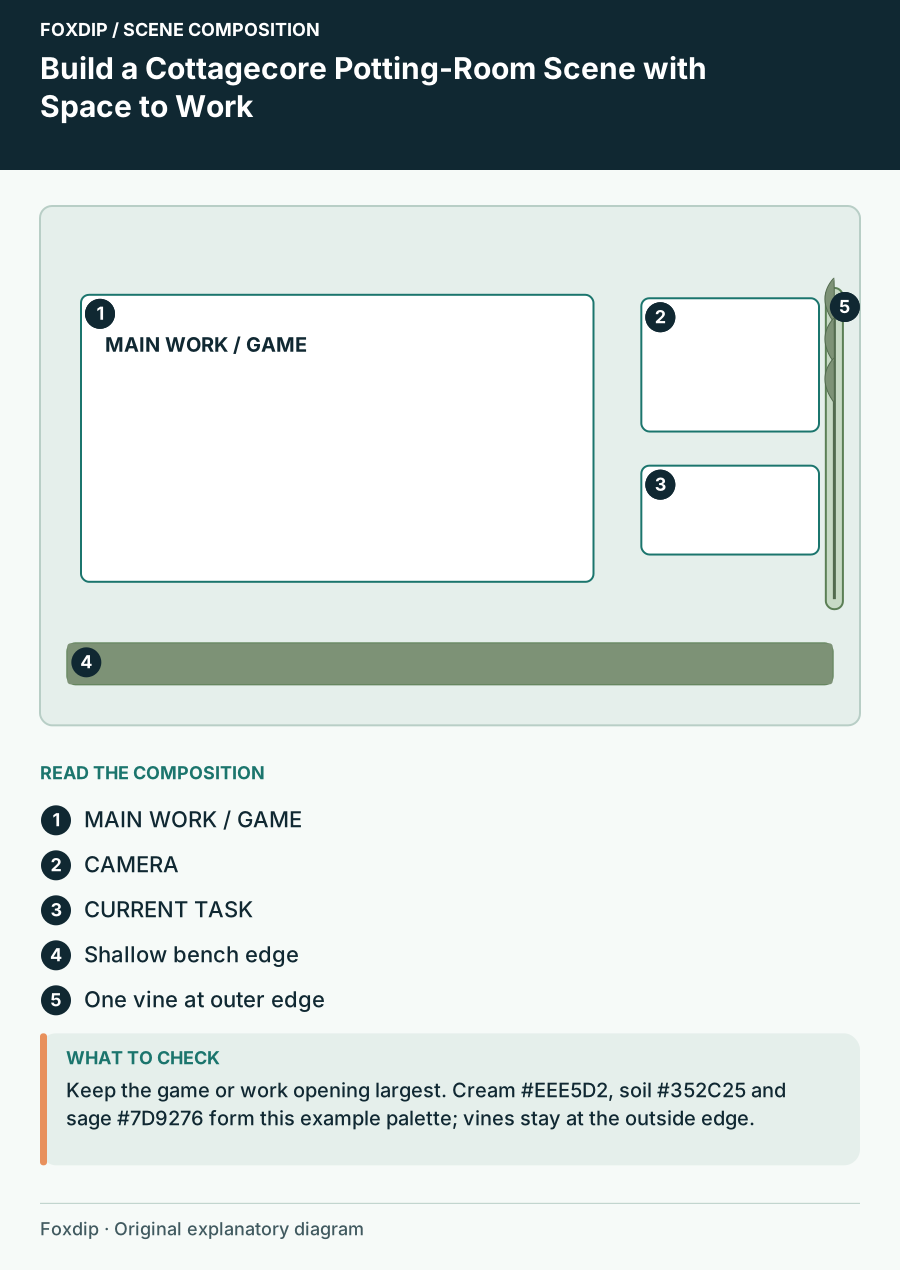
Original Foxdip scene plan. Positions illustrate this example; check the actual game or camera view.
Arrange a bench, a view and one information shelf
On a 1920×1080 example canvas, reserve the large left area for the main content and a narrower right column for a face camera and short task note. Treat the bottom as a shallow bench edge, not a thick border. Keep the main content proportional and use any spare area for the setting rather than stretching the picture.
Put the camera near the upper part of the side column, with the current project underneath. A leaf can climb the outside edge of that column, leaving its inside edge plain. This creates a useful visual boundary: the garden imagery belongs to the room; the uninterrupted opening belongs to the stream.
Use materials to control the palette
Try plaster cream for quiet surfaces, soil brown for the outer frame and sage for a limited accent. Reserve a deeper charcoal or brown panel for important cream text. These colours are a mood proposal; compare actual text contrast before adopting a pair. Pale sage on cream can disappear even when both feel appropriate to the theme.
| Role | Example colour | Where to use it |
|---|---|---|
| Room base | #EEE5D2 | Quiet background surfaces |
| Structure | #352C25 | Bench edge and text panel |
| Accent | #7D9276 | One stem and small markers |
| Message | #FFF7E7 | Text on the dark panel |
Repeat one plant shape across the channel
Choose one simple leaf shape and repeat it at different scales: a larger silhouette on the waiting scene, a small corner detail on the task card and a modest divider in channel panels. You do not need identical illustrations everywhere. A consistent edge shape and colour can make different assets feel related.
Keep text labels separate from plant illustrations when your workflow allows it. A changing project name then stays editable, and the same scene can serve a seed-sowing game one week and a real craft the next. The useful continuity is the room and material language, not a permanently painted task name.
Keep motion away from the work
If you add animation, choose one slow environmental movement such as a small light shift near the window. Avoid moving vines across the content opening or floating leaves over the hands. These effects can be charming during a break but distracting when viewers are watching a precise action.
Give alerts a plain patch near the side-column task note. Their appearance should not obscure the work surface. Try the longest expected name and a full alert cycle while the scene is busy, then adjust the reserved region before adding more ornament.
Review a real task, not an empty room
Place actual gameplay or a sample overhead recording into the layout. Check light and dark content, hands reaching toward the corners and any game labels at the lower edge. The potting-room theme should remain visible without reducing the main task to a small picture window.
If choosing artwork from our shop, use this composition as your brief and confirm the active listing’s real dimensions, layers and wording. A suitable setting might need only a background and a few accents. The finished result should feel like a place where the stream happens, with a work area viewers can comfortably follow.
Sources & references
Foxdip editorial design advice with platform behavior grounded in the linked official documentation. Layout dimensions and palettes are worked examples, not platform requirements.
- OBS: Aspect Ratio Guide ↗Checked 2026-10-27
- OBS: Stream Layout Tutorial 1: Game Screen ↗Checked 2026-10-27
Spotted something out of date? Let Alex know.
How we put our guides together ↗